Thursday, June 26, 2008

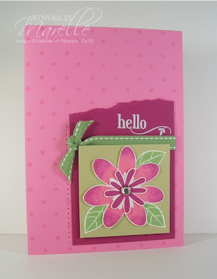
Kristina Challenge #13

Regal Rose, River Rock, Whisper White,
Wild Wasabi, Purely Pomegranate
As soon as I saw this colour combo, I loved it, so I don't know why I struggled with it. My desk looks like a bomb site of rejected stamped images and uncleaned stamps!
In the end I did what I am always telling my customers to do...go to the catalogue and use it for inspiration. In this case, I used our new mini (page 4) for the layout, and that gave me the kick I needed.
Marelle Taylor Stampin' Up! AustraliaI've used flowers and leaves from an old fave Bodacious Bouquet. I rock 'n' rolled the big flower, but blended the ink on the stamp with my aqua-painter before stamping it on Whisper White cardstock and cutting it out. The rest of the card is pretty simple...more cutting out, a Rhinestone brad, rub-ons, paper piercing, Wild Wasabi ribbon and Polka Dots (stamped in Versamark ink).

Now I'm going to take some of those poor rejected stamp images and make some cards with them (and I might even tidy my desk!)


Wednesday, June 25, 2008

I'm Back!

I had the most relaxing weekend away, tasting wine and enjoying delicious food and the company of dear friends...but since then it's been all go, and here it is, Wednesday already, and it's my first Blog entry for the week! I still have lots to do, including sending this month's newsletter out, so this will be a quick one.

I am running a class every night this week. Last night was a Stamp-a-Stack class. I run these every Tuesday night (and one Tuesday morning) and the same class runs for a month. So last night was the fifth time I've run the class this month (phew!)

Everyone made 8 cards. This was one of the designs:
Marelle Taylor Stampin' Up! AustraliaRather than making 4 identical cards, I like to give them the option of making 4 cards that are the same, but different. We used the Priceless set, with the addition of 2 Jumbo Wheels (So Swirly and Star) and made 2 girly cards and 2 for the boys.

The colours are Groovy Guava, So Saffron, Wild Wasabi for the girls and Pumpkin Pie, Blue Bayou and Wild Wasabi for the boys.

If you like the idea of making a "stack" of cards in one sitting, you can check out some other Stamp-a-Stack designs in the "Stamp-a-Stack" category over there ----------->

My repeat Hostesses often like to have a Stamp-a-Stack party for their next Workshop booking rather than a traditional workshop. This way, everyone pays a small fee, but gets to take home a whole bunch of cards. Contact me if you'd like to book a Stamp-a-Stack party in your home!

Friday, June 20, 2008

Colour Challenge Number 12

I'm heading off to the Hunter Valley early tomorrow for the weekend with some friends (plenty of wine tasting to be done, and no kids!), so I thought I'd better get cracking and do Kristina's latest colour challenge before we go.
The colours are Sahara Sand, So Saffron, Whisper White and Wild Wasabi.
This was a quick one to make, and I took my inspiration from page 122 of our Aussie catalogue.
Marelle Taylor Stampin' Up! AustraliaI embossed the circles from "Priceless" with white embossing powder, and stamped various flowers from the priceless set in So Saffron and Wild Wasabi, and punched them out with the Bouquet Flower punch, and also used the 1/4" circle punch for some of the flower centres. The sentiment is a rub-on, and the brads are silver that have been coated in White embossing powder. To do this, just heat up the brad, so the powder will stick to it (hold them with tweezers so you don't burn your fingers!) then dip it in white Embossing powder, and re-heat to melt the powder. Voila!
Some paper piercing and Wild Wasabi double-stitched ribbon finish it off. The main piece has also been raised up on Dimensionals, and so have the little flowers. I don't know if you can see it in the photo, but I've also scored a border on the white cardstock, to frame the main piece. It adds an elegant touch, and makes the white not so plain.

Blending colour directly on rubber

A few of you have asked how I did the multi-coloured flower image in my last post, so I thought I'd go into a bit more detail and also show you another example. Applying colour to a bold stamp before you stamp it is one of my favourite ways to add impact to a card. It's quicker than watercolouring a line art image, but still looks great. You simply use markers to colour directly on to the rubber in whatever shades you desire.
Marelle Taylor Stampin' Up! AustraliaHere, I've coloured with Almost Amethyst on the outer rims of the petals, and Apricot Appeal towards the centre, using the brush-tipped end of my marker. I've left a small blank space where the 2 colours would meet, which is where I'll do some blending. Use a fine-tipped Aquapainter with water in it, but dry the tip off on a tissue, so it isn't too wet. Then, just blend the 2 colours together. You don't want to end up with a muddy brownish colour, so don't overwork it. A few strokes should do it. Then stamp onto Whisper White or Very Vanilla cardstock, and hold your stamp down on the paper for a few seconds, to allow the colour to soak in. I've found that you won't get a very good result on other types of cardstock.
Next, I've done some 2-step-stamping with this image, where I've inked up the matching line image with my markers, and stamped it over the top of the bold image, to give a dimensional look.
The vellum has been wheeled with the Scatter Sunshine Jumbo wheel in White Craft ink. I've attached most of it behind the main image, so the adhesive won't show, with just a few bits of Snail adhesive behind some of the whiter flowers. The Snail adhesive is invisible under vellum if you use it behind a patterned area. I've torn the bottom of the Apricot Appeal cardstock.
The rest of this card is pretty simple: paper piercing in the corners, 3 Apricot Appeal brads in the lower right-hand corner for balance (I used the Paper Piercing template to get them lined up straight!)
I hope that helps those of you who have had trouble colouring and blending straight onto your stamps. Those of you who haven't tried it, why not give it a go!

NEWSFLASH! There will be a new mini coming out on the 1st August, and I received my Demonstrator copy today (one of the things I love about being a demo is getting to see it all first!). We get to pre-order on the 1st July, and I have an enormous wishlist already. Some of the sets I've been eyeing off on US blogs will be here really soon....YAY! Email me if you desperately want to know if your favourites have made it here!

Tuesday, June 17, 2008

A Swap!

Marelle Taylor Stampin' Up! AustraliaParticipating in swaps is lots of fun, and always inspiring. This is the card I made for a recent swap I was in with 5 other lovely ladies. Actually, this isn't the exact card that they received. I ended up deciding to stamp "En Francais" in Old Olive ink on the Old Olive piece, and I prefer it with that added detail. I think I used just about every background stamp I own on this card!
There are quite a lot of steps to this card, but you're all always telling me you like reading my descriptions, so here goes!
First, I stamped Linen Background on the Very Vanilla piece really lightly. I used Creamy Caramel ink and used the fifth impression (so I stamped 4 times on scrap card-stock before stamping on the Very Vanilla piece). The Brocade Backgrounds stem and leaves has been stamped in Old Olive ink on Very Vanilla card-stock. I stamped the flower on a separate piece of Very Vanilla card-stock and cut it out. I got a multi-coloured flower by colouring the inner part with a Pumpkin Pie marker, and the middle with a Rose Red marker, and then I inked the edges by rolling the stamp in the Purely Pomegranate inkpad. I then blended the colours on the stamp with an Aquapainter, before stamping it on Very Vanilla Card-stock, and cutting it out.
TIP: always leave a narrow white border when cutting out images. It's much more forgiving on the eye than trying to cut right up to the edge.
I attached the inner part of the flower with my 2-way glue pen (great for getting into small areas), and popped the outer part of the petals up on dimensionals. I sponged the edges of this piece with Close to Cocoa ink, and layered it on a piece of Chocolate Chip card-stock.
The Old Olive piece has also been stamped with Linen background in Versamark ink (I just love the subtle texture this gives!), and the edges sponged in Old Olive ink. The main card is Purely Pomegranate, stamped with Paisley background, in Versamark ink.
The greeting is from Occasional greetings, stamped in Chocolate Chip ink. I punched it out with my Oval punches (what on earth did I use to do before I had these???), with more sponging in Close to Cocoa.
The ribbon is Wide Chocolate Chip grosgrain.

Friday, June 13, 2008

Colour Challenge Number 11

I was excited to see the latest Colour Challenge is up on Kristina's website. It was perfect timing for the Stamp, Scrap 'n' Chat night I had tonight at my house. And here I am, uploading at midnight, as I have to go to Wollongong (1 1/2 hours drive away) for a workshop tomorrow, and I won't be back until Sunday.
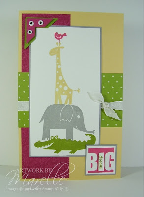
I would never have put this combo together! Rose Red, Old Olive, So Saffron, Going Grey and Whisper White. I pulled out a stamp set that I love, but haven't used for a while, Wild About You. I stamped a tower of animals, and built the card from there. I thought "Dream Big" was an appropriate sentiment!
Marelle Taylor Stampin' Up! AustraliaI'm not too sure about this one...let me know what you think!

Wednesday, June 11, 2008

My Favourite Stamp Set

I know it was mean of me to make you choose just one favourite stamp set, but I really enjoyed reading all your responses (you can read them all HERE). The most popular choice was Baroque Motifs, followed by Scribble This, Garden Whimsy and Bud Basics. I already told you 5 of my favourites in THIS post, but I thought it was only fair to tell you all my favourite set at the moment, since I made you all choose just one.
I'm loving Boho Backgrounds at the moment. That circle stamp is so much fun to layer, the backgrounds are gorgeous and easy to use, and it even has some words thrown in. It can be masculine or feminine, depending on the colours you choose.
Having said that, I'll probably have a different favourite in 2 day's time, but that's it right now :o)
Marelle Taylor Stampin' Up! Australia
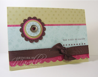
So, I thought it only fitting that I show you a card made with this set. The colours I've used here are River Rock, Rose Red, Soft Sky and Chocolate Chip. I used some of the Palette o' Prints paper for the Rose Red, in the Paisley pattern. I've inked up just the bottom 2 lines of the sentiment stamp, and used a Jumbo eyelet in the centre of the circles as an accent. The scallops at the bottom have been done using the new Corner Rounder Punch.

Using my Trusty Bingo machine, I have drawn out 32, ?? (it rolled under my bookcase and I can't get it out!), 99, 54, 31 BINGO! There were 31 comments, so the lucky winner is number 31, Sandie Carter! Send me an email Sandie, and I'll pop a Palette o' Prints on it's way to you!

Edited to Add: As I was posting this, there was one more comment, number 32, from Melanie W. Since I'm feeling generous, and I did pull out number 32 first, Send me an email Melanie, and I'll pop a Palette o' Prints in the mail to you too :o)

Sunday, June 08, 2008

A Fun Card Layout

Before I show you today's card, just a quick reminder about my Blog Candy. I'm going to give it another day, to give a few more people a chance to win!
Just leave a comment on THIS POST <----click

Marelle Taylor Stampin' Up! AustraliaI'm not sure where I originally saw it, but I've been making a few cards lately using this layout, including this one for the Elite Challenges Blog. I hadn't used this set, despite loving it the moment I saw it, and acquiring it quite awhile ago (I'm sure you can all relate to that!). It's the Level 2 Hostess Set "Spring Solitude".
This is also a Colour Combo that I hadn't tried before: Soft Sky, Chocolate Chip, Groovy Guava and Wild Wasabi. Choosing the colours just came about as I was inking the stamps. I needed a brown for the branch, green for the leaves, and I wanted blue for the bird and something in a warm tone for the flower. Chocolate Chip is a lovely, rich brown, and the In Colours called me for the rest.
The bird has been stamped separately, cut out and mounted on Dimensionals. I did the Polka Dots with my Polka Dot Background stamp. This has been getting a work-out lately; it's soooo easy to use. I stamped the floral background using the 3-flower stamp, stamped repeatedly, and over-stamped in the bold flower in the 3 In Colours. Then, the whole thing looked too busy and bright, but instead of screwing it up and starting all over (which I was very tempted to do!), I put a piece of vellum over it to soften it, and voila, it was instantly much better!
The word 'friend' is from the set "Forever in my Heart", and has been punched out using the small Oval punch, and Mounted on the Large Oval.
I'll be interested to hear what you think of this card...I'm not sure whether I like it or not. It definitely wasn't what I had in mind when I started stamping with this set! But then, that's one of the things I like about stamping...you never know what you're going to get (just call me Forrest Gump ;o)

Wednesday, June 04, 2008

Making a Good Impression: A Tutorial

One of the questions I often get asked is how to get bold rubber images to stamp clearly. It can really ruin the look of a card if the stamped image is patchy instead of crisp and clear. I love bold stamps for the striking and instant splash of colour they provide. They make a really quick card, since there's no need to go back and colour in.
There are 3 things that you have to get right when making a good stamped impression: Stamps, Ink and Paper.

Stamps
When a stamp set is new, you may need to condition the rubber. This will remove any residue left from the manufacturing process, and prepare the rubber to accept the ink evenly.
Here is a stamped impression of a stamp before it has been conditioned:

Marelle Taylor Stampin' Up! Australia This is the same stamp after conditioning:
Marelle Taylor Stampin' Up! AustraliaThere are a few ways to condition your stamps. I start off by simply giving the stamp a good clean on my Stampin' Scrub, with a good spray of Stampin' Mist. The mist will clean and condition the rubber. Often a couple of good scrubs is all it needs for it to stamp perfectly.

If the image is still patchy, here are some other things you can try:
  • Stazon Cleaner. Leave it on for a few seconds and then wipe off.
  • An old pair of jeans. Just rub the stamp on your leg while you're wearing them. Yes, really!
  • An eraser. Rub the stamp all over.
  • Adhesive Remover. This will remove any tacky residue.
  • Sanding Block. Don't be afraid to give the rubber a light sand. You won't harm it!

Ink
I prefer to use dye ink for bold stamps. It will soak in to the paper and leave a nice, even image. Dye inkpads also have a firm surface, rather than a spongy one, which makes it easier to ink up stamps evenly. The other benefit they have is that they dry quickly = no smudging!
To ink a bold stamp, "smoosh" the stamp into the inkpad (that's the technical word for it, meaning twist it from side to side LOL), and then tap, tap, tap onto the inkpad to make the ink even. Stamp onto your paper, pressing firmly, and don't lift the stamp up straight away. Leave it to soak in for a few seconds.

Paper
This one is really important. You can condition your stamps 'til the cows come home, but if you aren't stamping on to good quality paper, you might as well not bother. I use Stampin' Up! Whisper White and Very Vanilla for stamping bold stamps. It is ultrasmooth, and quite simply, it has been designed for stamping on.
Here's a side-by-side comparison:
Marelle Taylor Stampin' Up! AustraliaOn the left is ordinary white cardboard from a stationer, and on the right is Whisper White.

A few other tips:
Make sure you are stamping on a solid table or bench (if you are using a trestle table, stamp at the end where the legs are, rather than the middle, where it can bend.) I stamp on a pad of Stampin' Up! grid paper. Not only do the lines help me line things up straight, but the pad provides some cushion, which also helps to make an even stamped impression.

I hope this Tutorial helps you all make a good impression with your bold stamps!
all images © 1990-2008 Stampin' Up!®

Tuesday, June 03, 2008

June Promotions

It's very exciting that there's not just one, but TWO great promotions for June.

The first one is "eScape":

Remember when you got letters in your mailbox instead of your inbox? On 25 June 2008, Stampin' Up! is taking the day to unplug and unwind, and reconnect on a personal level with friends and loved ones through handmade cards. And we invite you to eScape with us throughout the month of June!
I just love this idea. Nothing makes my day more than opening the mailbox to find a hand-made card, and I think we all need a gentle reminder every so often to break away from the "e".

The second Promotion is "Extra, Extra":
Marelle Taylor Stampin' Up! AustraliaI know my Hostesses who have already booked a Party between June 1 and July 15 will be thrilled about this promotion. Who wouldn't be happy about having an extra $50 to spend?!
I still have a couple of spots available, if you'd like to invite a few friends over to your house to see a free stamping demonstration in your home. I make a few projects on the day, which you also get to keep, and all of your guests make a card to take home. It's a really fun way to spend a couple of hours. I do in-home demonstrations at all times, mid-week, plus weekends.

Email me, if you'd like to join the fun!

Happy Birthday to Amy! + BLOG Candy

We've had a busy few days around here, celebrating the Number 11. Amy turned 11 on Friday, but it has turned out to be a big 4 days of celebrations, by the time we covered school friends, church friends, and various family members!
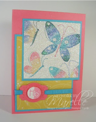
Marelle Taylor Stampin' Up! AustraliaThis card was actually a challenge by Amy. She told me which colours to use (chosen from the Colour Coach), and which stamp set... I did the rest! It was a fun way to make a card for her, and she was excited to see how it came out. The colours she chose are *bright!* Cameo Coral, So Saffron and Tempting Turquoise, with a splash of Glorious Green and Ballet Blue. The stamp sets I used are Garden Whimsy and Party Punch (level 1 Hostess set). I also used some Palette o' Prints DS paper. This promotion has now finished, but keep reading for some BLOG CANDY that could come your way!
I inked up the butterflies using my markers, blended the colours a bit on the rubber with my Aquapainter and stamped them on Whisper White cardstock. When I had finished stamping, I inked the whole piece in Versamark, by pressing my Versamark inkpad all over it. I then sprinkled the piece with Heat-and-Stick powder, and heated it until it was just shiny. I then sprinkled with Dazzling Diamonds glitter, and re-heated it to set the glitter. It's hard to tell from the photo, but the sparkle is truly dazzling! I also made the 'Hb' sparkly by colouring it with 2-way glue, and sprinkling glitter on top. (I could have done this with Versamark and heat-and-stick powder, but I'd already put my heat gun away ;o)
I used the Designer Label punch for the greeting (don't you just love how the stamps and punches co-ordinate!). I punched a hole at either end with the Double rectangle punch to thread the ribbon through. I also highlighted some areas of the Designer Series paper with a white gel pen.
I think Amy liked her card :o)
Now, about that Blog Candy....I have a pack of unopened Palette o' Prints paper here. It's a 6"x6" pad of 48 sheets of double-sided paper in 4 gorgeous colours. If you'd like to receive this in your mail-box, just leave a comment telling me your favourite Stampin' Up! stamp set in the current Idea Book & Catalogue, and why! It's as easy as that.

I'll randomly pick a winner in a few days (Aussie residents only and no SU! Demos, sorry!)

Sunday, June 01, 2008

Another Kristina Challenge

Just what I needed on a rainy Sunday afternoon...some lovely summery colours!

Marelle Taylor Stampin' Up! AustraliaI had no trouble at all with this colour combo...these are soooo my colours! In a way though, that made this card a bit harder to make. The colours didn't really steer me in any particular direction. In the end, I was steered by my workshop hostess from yesterday, who showed me that the 5-petal flower punch fits one of the flowers from "In the Spotlight" perfectly (it was a light bulb moment, I tell ya!). Then I just started playing around with other flowers from the set and punches, and before I knew it, I had 5 flowers on my desk, and the rest was easy :o) The colours we had to use were from this picture:
Old Olive, Bashful Blue, Whisper White, So Saffron and Not Quite Navy.
I used stamps from In the Spotlight, Little Pieces and So Many Sayings. And LOTS of punches: Scallop circle, 5-petal flower, 3/4" circle, 1" circle, 1/2" circle. The patterned paper is Old Olive Prints. I used my Stamp-a-ma-jig to get the row of dots straight, and to position "be happy" perfectly. I used markers to ink it up in Bashful Blue and Not Quite Navy.

If you look at the comments on Kristina's Blog, you can see all the other (150!! *gasp*) contributions.

LinkWithin

Blog Widget by LinkWithin